Dashboard overview page
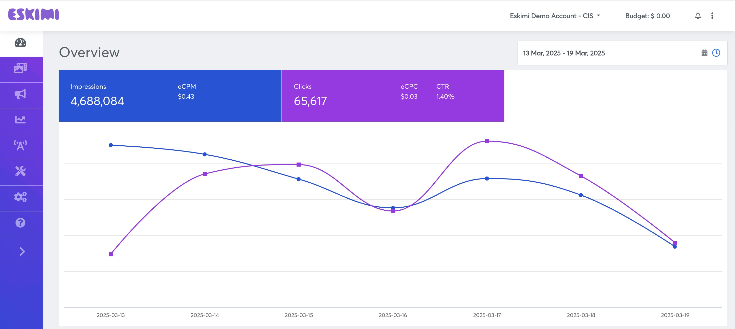
"The Eskimi DSP"DSP dashboardDashboard is ana at-a-glancecentralized view ofwhere alladvertisers yourcan campaignsmonitor and analyze their maincampaign KPI'sperformance inover thea selected period of time.period. It provides thean aggregated data from all campaigns that were running at the selected periodsummary of time.key Youcampaign canmetrics, seehelping you'reusers spent,track ad spend, impressions, clicks, and conversions in both numerical and graphical formats.
This dashboard enables advertisers to:
✅ Assess campaign effectiveness at a glance.
✅ Identify trends and patterns based on historical data.
✅ Compare multiple campaigns within the numericsame formtimeframe.
✅ Access deeper insights for optimization and strategic adjustments.
How to Use the Dashboard?
1. Selecting the Time Period
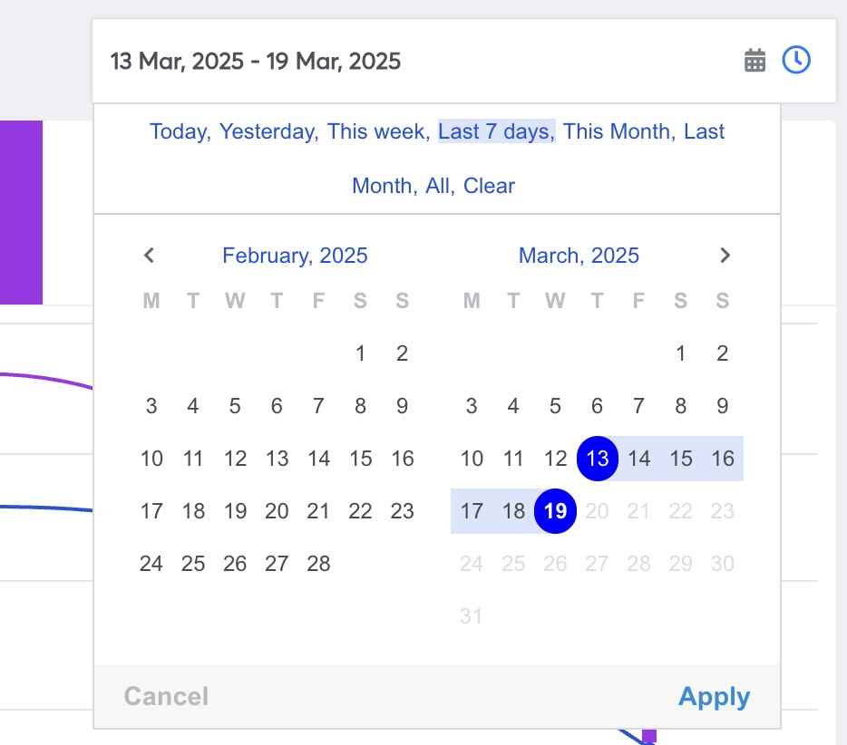
The Eskimi DSP Dashboard allows you to filter data based on a specific time range:
- Locate the time selection drop-down menu in the
graphictop-rightbelow.corner of the page. - Choose from pre-set time ranges (e.g., Today, Last 7 Days, Last 30 Days) or select a custom date range.
- Click Apply to refresh the data accordingly.
By adjusting the time filter, advertisers can focus on short-term or long-term campaign performance and identify seasonal trends.
How2. toUnderstanding usethe itDashboard ?Metrics
SelectAt the top of the dashboard, key performance indicators (KPIs) are displayed in numeric format, including:
- Total Spend – The amount spent on campaigns within the selected period.
- Impressions – The total number of times ads were displayed.
- Clicks – The number of times users interacted with the ads.
- Conversions – The number of desired actions completed (e.g., purchases, sign-ups, or downloads).
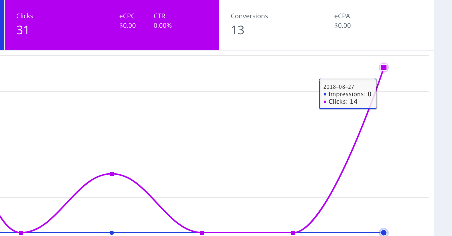
🔹 Visualizing Performance: Below the numeric KPIs, a graphical representation of the data helps identify trends over time.
- Hovering over the data points reveals precise values for impressions, clicks, and conversions on specific dates.
- The graph updates dynamically when the time
periodrangeinisthechanged,drop-downmakingmenuitineasythetouprighttrackcornerperformanceoffluctuations. - Scrolling
windowfurtherandprovidesclickapply.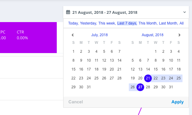
breakdowns for deeper analysis.You can see exactKPI's in the graphicjust by putting your mouse on the bubble. And as well you can see moredetailedgraphsvisualwhenreportsscrollingwithbelow.additional

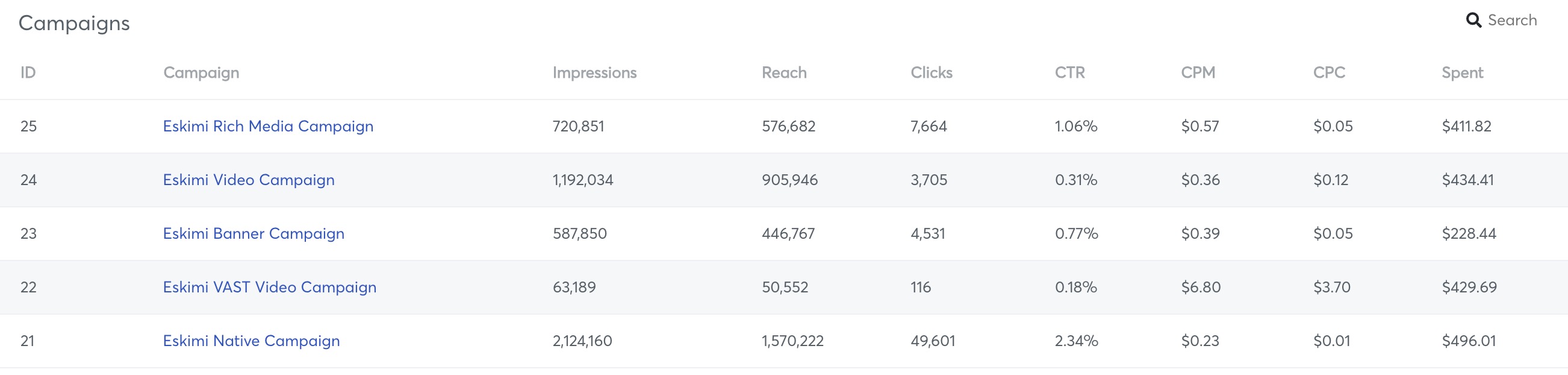
3. Active Campaigns Overview
BelowDirectly beneath the graphic,main youdashboard canmetrics, seea the list of all Activeactive Campaignscampaigns andis theirdisplayed. KPI'sThis insection theprovides selectedadvertisers periodwith a quick overview of time.individual Bycampaign clickingperformance.
🔹 theKey namefeatures of the certainActive Campaigns list:
- Each campaign’s spend, impressions, clicks, and conversions are displayed.
- Clicking on a campaign
younamewillredirectsbe directedusers to its detailed Report page., where more granular insights can be accessed. - Users can compare performance across multiple campaigns to determine which strategies are working best.
4. Additional Insights & Performance Breakdown
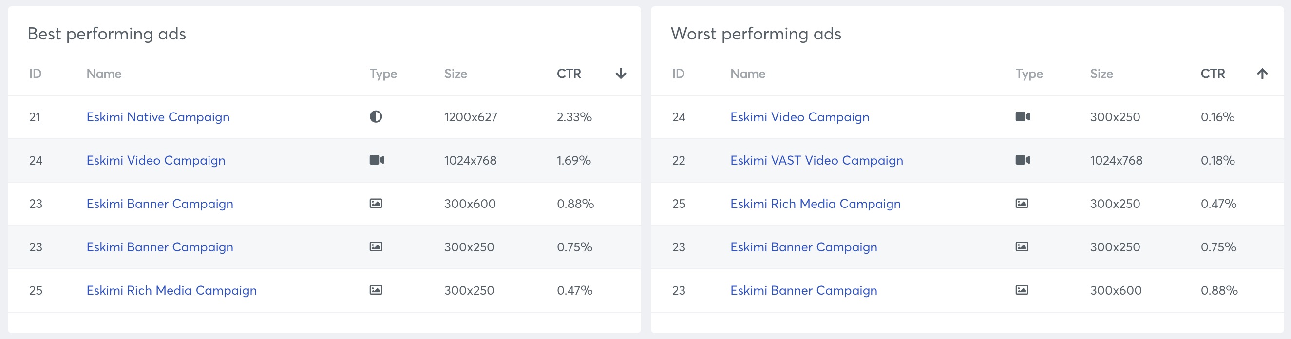
Further down the dashboard, advertisers can access in-depth performance analysis, including:
Down
✔️ belowBest-Performing the& Worst-Performing Ads
- Displays a ranked list of
All Active Campaigns you will find relevant informationtop andgraphs about Bestlow-performingads/adsWorstbasedperformingonads,engagement,Platformsconversion rates, and other key metrics. - Helps advertisers identify creative elements that resonate best with their audience.
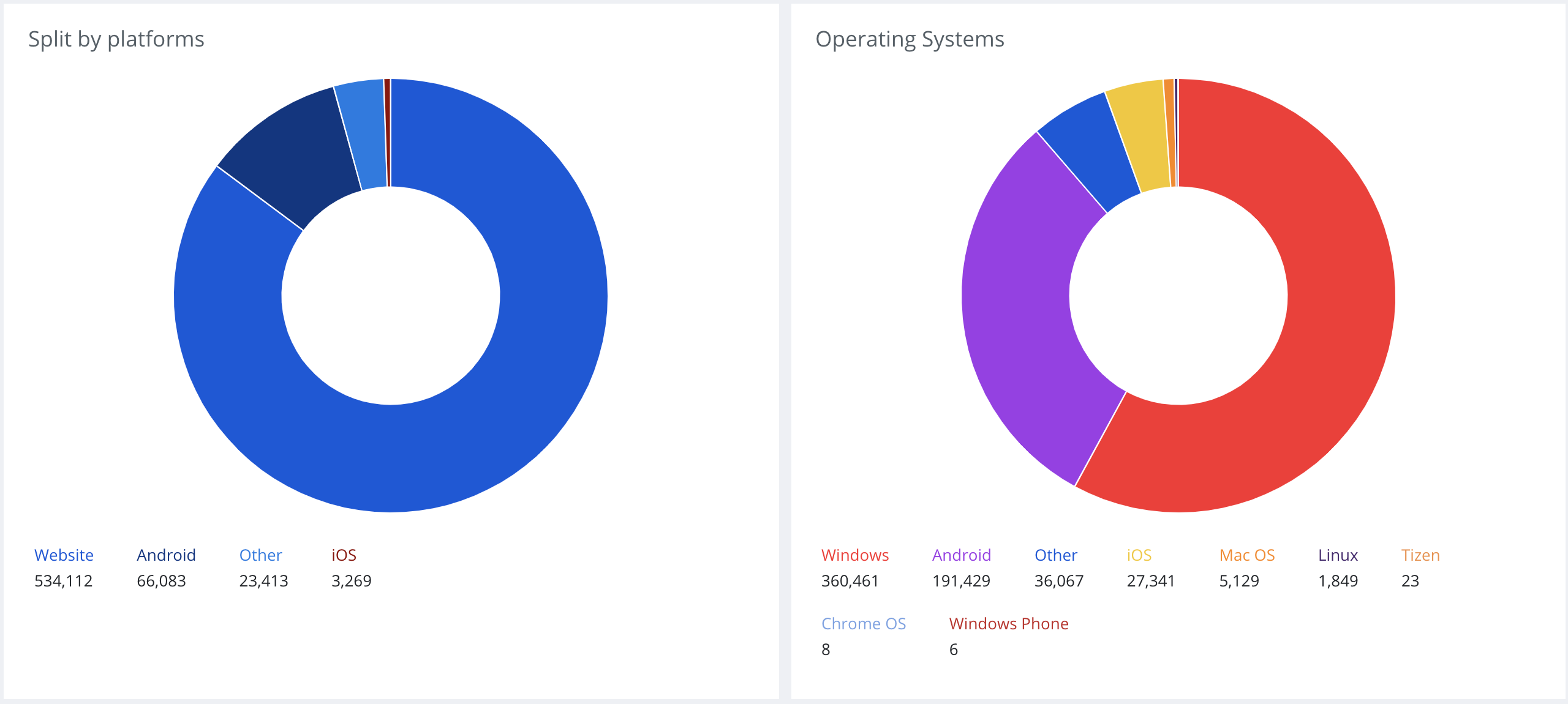
✔️ Platform & Operating systemsSystem used,Distribution
- Shows which devices and platforms (mobile, desktop, tablet) are driving the most engagement.
- Breaks down performance by operating system (Android, iOS, Windows, etc.), allowing advertisers to optimize for the best-performing environments.
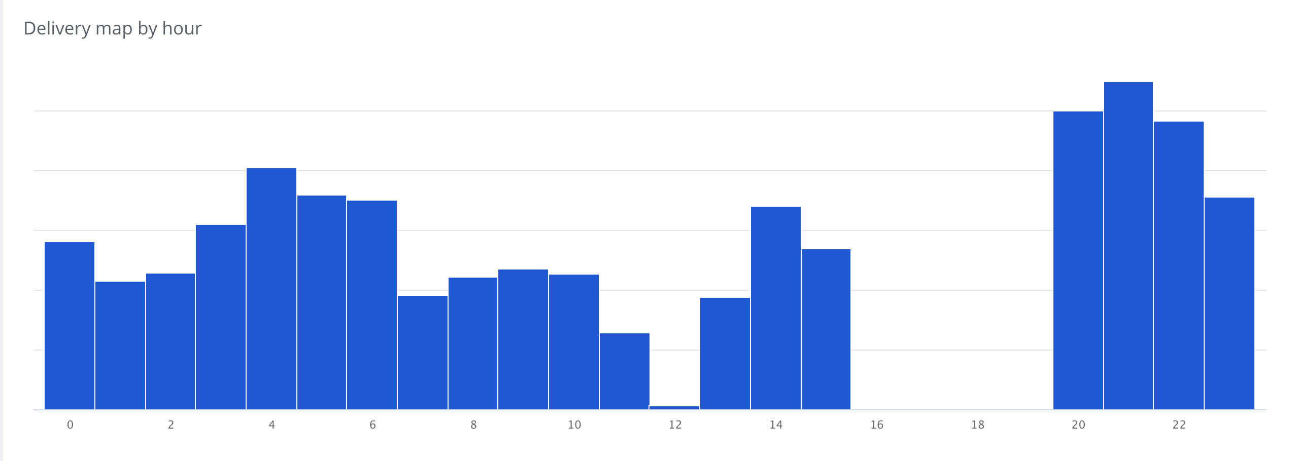
 ✔️ Delivery
 mapMap by(By hourHour or byWeekday)

- A heatmap visualization
displaying when ads receive the most impressions and interactions throughout the day or week. - Helps advertisers optimize ad scheduling and budget allocation based on peak performance times.
Why Use the Eskimi DSP Dashboard?
The Eskimi DSP Dashboard is a powerful tool for campaign monitoring and optimization. By providing real-time insights and historical data, it enables advertisers to:
✅ Make data-driven decisions for better performance.
✅ Identify trends and adjust campaign strategies accordingly.
✅ Optimize ad placements, budgets, and targeting based on detailed reports.
By leveraging the Eskimi DSP Dashboard, advertisers can improve efficiency, maximize ROI, and refine their digital advertising strategies with ease. 🚀